

Data Quality Report: Definition, Template, Examples, and How to Build One

February 12, 2026 - 12 min read

Author
A data quality report is the document you publish when the business needs to stop guessing about data reliability. It turns invisible data defects into tangible risks, then ties those risks to owners, timelines, and fixes.
Often, dashboards only show you what is happening, and it might not be enough. A data quality report explains why data quality issues are occurring, where they are happening, and who is responsible for addressing them.
In this guide, you’ll learn what a data quality report is, the core elements and dimensions that make it actionable, the metrics and severity scoring that drive prioritisation, plus a ready-to-use data quality report template to help you get your reporting up and running quickly.
What is a data quality report?
A data quality (DQ) report is a structured, repeatable document that measures the health of a dataset against defined rules and standards, then translates the findings into impact and action.
It typically covers:
- Which data was tested
- How it was tested
- What failed
- How severe the failures are
- What should be fixed first
Data quality report is a governance and accountability tool that allows business leaders, data owners, and engineering teams to make decisions based on evidence rather than gut feel.
Data quality report vs. other data quality artefacts
It’s helpful to distinguish a data quality report from other common DQ artefacts.
Data quality report vs. dashboard
Firstly, let’s take a look at a dashboard. A dashboard is mainly a monitoring tool for day-to-day operations. Teams usually run it upstream, at ingestion or early staging, before data is transformed and loaded into a data warehouse. DQ reports, on the other hand, are usually a downstream artefact that provides an overview of the entire data pipeline.
Dashboards can catch issues early, but they won’t flag problems they were never designed to check. Without strong domain knowledge, understanding of the ins and outs of the data pipeline, and detailed rules, teams can’t build dashboards that can reliably catch all errors before data goes downstream.
In other words, regular data quality reports give dashboards their baseline and drive updates, for example, by turning repeated findings into new checks and alerts.
Data quality report vs. assessment
An assessment is broader, often done periodically, and focuses on maturity or readiness rather than specific, fixable issues. Teams may run assessments quarterly, ahead of launch, or regulatory changes. The main focus is to ensure that quality is managed in a repeatable way, with clear ownership and controls.
It might conclude that ownership for a certain metric is unclear or that mentoring doesn’t cover certain parts of the pipeline, but it won’t hand you a list of rows to delete or a failing check to fix.
A DQ report sits between dashboards and assessments. It is more narrative and actionable than a dashboard, and more operational than an assessment. It is the thing you share when you need agreement on the next step: fund a fix, change a process, enforce a validation rule, or assign ownership to the source system.
Assessments test readiness, dashboards surface anomalies, but reports explain them and assign responsibility.
Why do we need data quality reports?
Data quality is the most pressing issue for data teams and one of the most urgent issues across organisations. According to dbt Labs’ 2025 State of Analytics Engineering report, 56% of data teams name data quality as the most pressing challenge. Moreover, data quality is the second-largest area for increased investment over the next 12 months, after AI tools.
Data quality is the difference between a forecast you can trust and one you have to explain away. It is the difference between a customer receiving an accurate invoice and having to escalate a compliance issue. Most organisations feel the cost, but only some make it visible. A DQ report makes the cost visible.
Recent stats show how widespread the issue is.
- Accenture reports that 61% of data assets are not ready for GenAI;
- A 2025 report by the IBM Institute for Business Value (IBV) found that over a quarter of organisations lose more than $5M annually due to poor data quality, with 7% reporting losses of $25M or more.
- EY reports that 89% say data quality is important to their organization, but only 22% have a dedicated data quality program.
This is not just a fact bombing. These stats map to real-world tensions inside organisations.
In practice, the analytics or data team often becomes the last link in a chain. When the reports are wrong, the reaction is not “your upstream system is broken,” it is “your report is wrong.” A data quality report shifts the blame conversation into an ownership conversation. It makes the upstream system and its owners visible.
Data quality reports are also about company culture. In large organizations, people define the same metric differently, which leads to multiple truths.
Finally, the report is a forcing function. It creates a paper trail of issues and owners. If you only cleanse downstream, you end up with clean reports but dirty operational systems. A report helps prevent that by pushing accountability to the system of record.
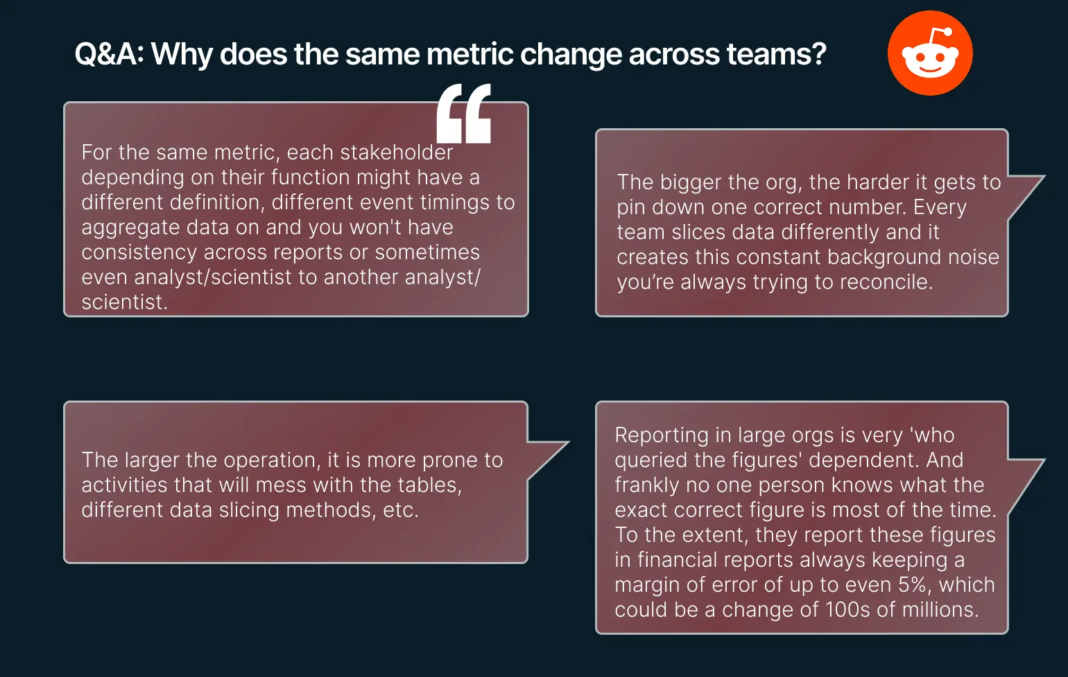 Data engineers’ thoughts on metrics changing across teams
Core elements of a data quality report (the 5-element answer)
A data quality report does not need to be long to be effective, but it must be complete. The easiest way to do that is a five-element structure.
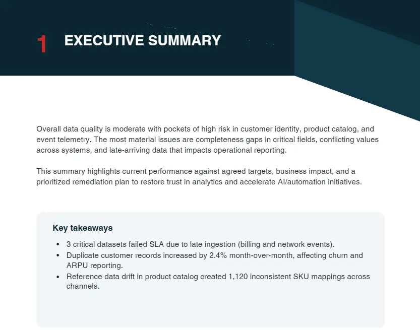
First, the executive summary. This is the one-page view of overall health, top risks, and the few decisions or approvals you need. If the executive summary is unclear, the rest of the report does not matter.
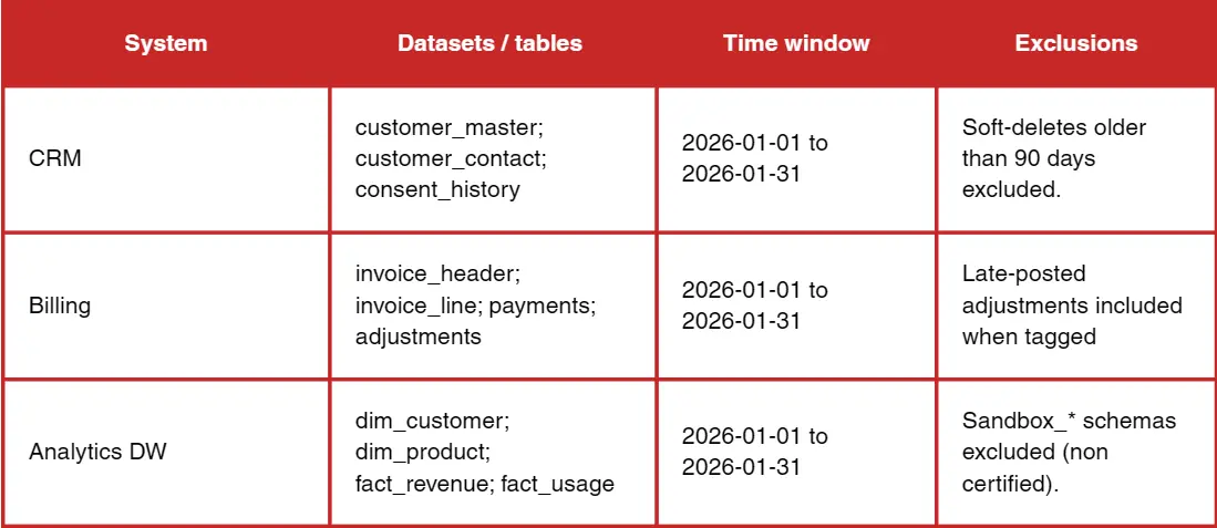
 Second, scope and data sources. This section defines what was tested and what was not. It should list systems, tables, the time window, and any exclusions. Reports lose trust when readers realise the dataset they care about was out of scope.
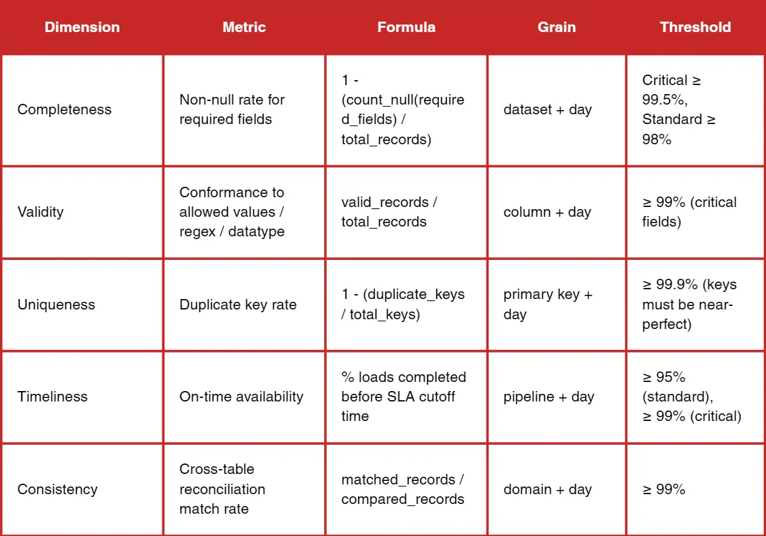
 Third, dimensions and metrics. This is where you define the rules and the formulas. It is not enough to say completeness. You must specify how completeness is measured, at what granularity, and what thresholds apply.
 Fourth, findings and root causes. Metrics alone do not drive action. You must explain why the failures happened, where they originated, and whether they are systemic or isolated. Trend data and drift detection belong here, not just pass/fail status.
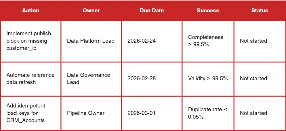
 Fifth, recommendations and an action plan. The report should end with a list of concrete remediation steps with owners and deadlines. Practitioners repeatedly emphasize that reporting without ownership is wasted. A data quality report is a management tool, not a spreadsheet.
 Dimensions for a data quality report
Most organisations use a common set of dimensions. The core six are:
- Accuracy
- Completeness
- Consistency
- Timeliness
- Validity
- Uniqueness
These cover the majority of business risk across analytics, operations, and compliance.
Some teams add integrity, reliability, precision, or fitness-for-purpose. These can be valuable, but only if they map directly to a business decision. A report with ten dimensions that no one understands is worse than a report with six dimensions that everyone trusts.
The right set depends on context. If your data is used for billing, accuracy and integrity are non-negotiable. If your data is used for operations with tight SLAs, timeliness matters more than precision. If your data drives customer segmentation or personalization, completeness and validity become the priority. The best reports make these trade-offs explicit instead of pretending all dimensions are equally important.
Want to know all data quality dimensions and the other metrics that matter? Read our guide to data quality audits.
Key metrics to include (with formulas)
A data quality report should define formulas clearly enough that two different teams would calculate the same numbers. The most common metrics are simple, and that is a good thing. You want to remove ambiguity.
- Completeness metrics usually include percent missing and percent required fields filled.
- Uniqueness metrics include duplicate rate by key.
- Validity metrics include rule pass rate and invalid value rate.
- Timeliness metrics include freshness, SLA compliance, and average latency.
- Consistency metrics include cross-system mismatch rate and reconciliation deltas.
- Trend metrics include weekly change and a simple monthly slope for key indicators.
Severity scoring matters more than most teams realise. If a missing rate spikes in a field that drives revenue attribution, that is critical. If the same spike is in a non-essential field, it is informational. The report should assign severity based on business impact, not technical purity. That is how you avoid a flood of failures that no one acts on.
Data quality report template
Most teams want a template they can reuse without reinventing the structure. The following is a simple report template expressed as a short outline so you can copy it into a document or a wiki and build from it.
- Executive summary (overall health, top 3 risks, decisions required)
- Scope and sources (systems, tables, time range, exclusions)
- Dimension score table (dimension, metric, threshold, result, trend)
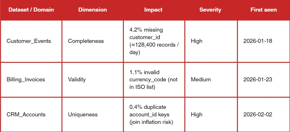
- Findings and root causes (issue summaries with impact)
- Issue log (severity, owner, status, ETA)
- Remediation plan (action, owner, deadline, dependency)
- Appendix (rules, SQL checks, data dictionary)
Examples and use cases
In a customer CRM, the report often focuses on missing contact information, duplicate contacts, and stale last-contact dates. The impact is obvious: sales outreach and attribution degrade. The report should include owner-level views, for example, by sales team or region, so responsibility is clear.
In finance master data, the report typically highlights mismatched cost centres, late postings, and inconsistent chart-of-accounts mapping. The impact is forecasting and compliance. Here, reconciliation checks are critical; you must show how numbers differ across systems.
In product catalogs, the report focuses on missing attributes, invalid SKUs, or inconsistent taxonomy. The business impact shows up in search relevance, pricing errors, and inventory mismatches. A report can reveal whether the problem is a data entry issue, a supplier feed issue, or a taxonomy governance issue.
In operational or IoT data, the report often tracks irregular device heartbeats, schema drift, and time skew. The impact is maintenance decisions and operational downtime. A report can make it obvious when data quality issues are driven by firmware updates or network changes.
Without clear metric definitions, large orgs will always have multiple numbers for the same metric. A report should state what the definition is and where it lives.
Tools and automation
You do not need sophisticated tooling to get started. For small datasets, a spreadsheet or a simple SQL-based approach can produce an effective report. The key is to be consistent and to make the metrics repeatable.
BI tools like Power BI or Tableau are useful for distribution and visualisation, especially when paired with checkpoint measures and reconciliation cards. Analysts and engineers often validate upstream in SQL and then use BI for presentation. This keeps the report grounded in reliable computation.
Data quality platforms and rule engines can accelerate reporting. Tools like Great Expectations, Soda, Elementary, and Pointblank are frequently mentioned by practitioners. But there is also scepticism about tools that overpromise. DQ tools often focus on pass/fail tests but miss profiling and reporting needs; simple dashboards sometimes win. The lesson is to start simple, then automate where it creates leverage.
Scheduling and alerts are essential for scale. Rule checks should run in orchestration pipelines or CI/CD. Alerts should focus on threshold breaches and anomaly trends, not just binary failures. The report then becomes the monthly or quarterly narrative tied to those alerts.
Want a practical rundown of data quality tools: when to use BI dashboards vs rule engines, and what to automate first? Explore our guide to data quality tools.
Common pitfalls of data quality reports
The most common pitfall is reporting too much. A report with fifty metrics reads like noise. Start with a small set tied to decisions.
The second pitfall is reporting without ownership. A report that lists issues without assigning owners is a scoreboard with no consequences. Every critical issue should have a name and a timeline.
AI Readiness: The Next Stage of Data Quality Reporting
The third pitfall is inconsistent definitions. If two teams use different definitions of active customer, the report will create disagreement instead of alignment. Make definitions explicit and store them in a shared glossary or data dictionary.
A solid data quality report is already a governance and accountability tool: it defines the rules, makes defects visible, and assigns owners and timelines. If you’re planning to adopt GenAI or machine learning, the same report becomes your starting line for AI readiness, because AI systems amplify the cost of missing values, inconsistent definitions, weak validation, and unclear ownership.
Vodworks’ AI Readiness Package is designed to build directly on what your report surfaces, turning findings into a practical roadmap and implementation plan. Depending on what your DQ report reveals, we typically plug in three pieces that fit naturally with this article’s workflow:
- AI Readiness Assessment (data-first): we evaluate data quality/completeness/consistency and how data is structured and stored, then map maturity and produce a clear improvement roadmap (so your “issue log + remediation plan” becomes an execution plan).
- Data preparation, cleansing, validation, and monitoring: we implement the fixes that keep recurring in reports, ingestion/transformation, cleansing/enrichment, and validation/monitoring mechanisms that prevent defects from reappearing downstream.
- Security, compliance, and governance for AI: we put audit trails, access controls, and governance frameworks in place so quality isn’t just “clean dashboards,” but durable controls at the source and across the pipeline.
Our team also runs use case discovery and feasibility/ROI checks so that AI implementation is tied to initiatives that matter most, and validated early via a PoC, instead of being a generic “data cleanup” program.
Book a 30-minute discovery session with our AI solution architect, and we’ll connect your current data quality report (or help you produce one) to an AI readiness roadmap: what to fix first, who should own it, and what foundations need to be implemented before you scale AI.

About the Author
Hussain Ali
With over 16 years of expertise, Hussain is a distinguished professional in full stack, mobile, game, and blockchain development. As a solution architect, he excels in pre-sales, displaying a strong inclination towards innovative strategies. Hussain has significantly impacted the gaming industry, contributing to both 2D and 3D games. Beyond coding, he actively shapes entire game narratives, including mechanics and story development. Dedicated to solving intricate challenges, he crafts meticulous technical proposals for Request for Proposals (RFPs), ensuring seamless integration of technology and business objectives.


Accelerate Your Projects With Our On-Demand Developers
Let's TalkTalent Shortage Holding You Back? Scale Fast With Us
Frequently Asked Questions
How do you handle different time zones?

With a team of 150+ expert developers situated across 5 Global Development Centers and 10+ countries, we seamlessly navigate diverse timezones. This gives us the flexibility to support clients efficiently, aligning with their unique schedules and preferred work styles. No matter the timezone, we ensure that our services meet the specific needs and expectations of the project, fostering a collaborative and responsive partnership.
What levels of support do you offer?
We provide comprehensive technical assistance for applications, providing Level 2 and Level 3 support. Within our services, we continuously oversee your applications 24/7, establishing alerts and triggers at vulnerable points to promptly resolve emerging issues. Our team of experts assumes responsibility for alarm management, overseas fundamental technical tasks such as server management, and takes an active role in application development to address security fixes within specified SLAs to ensure support for your operations. In addition, we provide flexible warranty periods on the completion of your project, ensuring ongoing support and satisfaction with our delivered solutions.
Who owns the IP of my application code/will I own the source code?
As our client, you retain full ownership of the source code, ensuring that you have the autonomy and control over your intellectual property throughout and beyond the development process.
How do you manage and accommodate change requests in software development?
We seamlessly handle and accommodate change requests in our software development process through our adoption of the Agile methodology. We use flexible approaches that best align with each unique project and the client's working style. With a commitment to adaptability, our dedicated team is structured to be highly flexible, ensuring that change requests are efficiently managed, integrated, and implemented without compromising the quality of deliverables.
What is the estimated timeline for creating a Minimum Viable Product (MVP)?
The timeline for creating a Minimum Viable Product (MVP) can vary significantly depending on the complexity of the product and the specific requirements of the project. In total, the timeline for creating an MVP can range from around 3 to 9 months, including such stages as Planning, Market Research, Design, Development, Testing, Feedback and Launch.
Do you provide Proof of Concepts (PoCs) during software development?
Yes, we offer Proof of Concepts (PoCs) as part of our software development services. With a proven track record of assisting over 70 companies, our team has successfully built PoCs that have secured initial funding of $10Mn+. Our team helps business owners and units validate their idea, rapidly building a solution you can show in hand. From visual to functional prototypes, we help explore new opportunities with confidence.
Are we able to vet the developers before we take them on-board?
When augmenting your team with our developers, you have the ability to meticulously vet candidates before onboarding. We ask clients to provide us with a required developer’s profile with needed skills and tech knowledge to guarantee our staff possess the expertise needed to contribute effectively to your software development projects. You have the flexibility to conduct interviews, and assess both developers’ soft skills and hard skills, ensuring a seamless alignment with your project requirements.
Is on-demand developer availability among your offerings in software development?
We provide you with on-demand engineers whether you need additional resources for ongoing projects or specific expertise, without the overhead or complication of traditional hiring processes within our staff augmentation service.
Do you collaborate with startups for software development projects?
Yes, our expert team collaborates closely with startups, helping them navigate the technical landscape, build scalable and market-ready software, and bring their vision to life.
Our startup software development services & solutions:
- MVP & Rapid POC's
- Investment & Incubation
- Mobile & Web App Development
- Team Augmentation
- Project Rescue
Subscribe to our blog
Related Posts
Get in Touch with us
Thank You!
Thank you for contacting us, we will get back to you as soon as possible.
Our Next Steps
- Our team reaches out to you within one business day
- We begin with an initial conversation to understand your needs
- Our analysts and developers evaluate the scope and propose a path forward
- We initiate the project, working towards successful software delivery